Wednesday 24 March 2010

Magazine - double page spread 2.


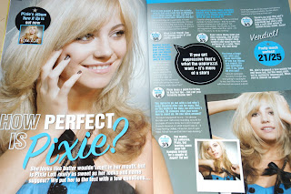
I have chosen to aspire to this double page spread article as i feel it is of a similar target audience to my own music magazine. I like the layout of this double page spread. I like how the image of the artist dominates the left page of the article. This could represent her importance/authority. I also like the over-lapping of the title of the article over the main image and the other smaller images on the right hand page.

Magazine - double page spread


This is a double page spread article which I found in a 'Bliss' magazine. I really like how there is a large main image of the artist which takes up one of the A4 pages. By doing this, it shows her domination of the article and shows that she is the main focus. The double page looks neat and organised as the photos are seperated from the text in neat boxes and the text is split up by questions which are in different colours to the answers. This makes everything clear and easy to read.

Tuesday 16 March 2010

My finished Music Magazine Contents Page


This is my finished contents page for my music magazine. I have used bright vibrant colours for the background of the page which links to the target audience for my magazine - teenage girls. I feel that the bright vibrant colours will help attract the consumers gaze because the page will stand out from any other contents page. I have also split the page into 3 sections which are each clearly represented by the use of different colours.

By doing this, it enables the overall look of the page to be organised and also breaks up the text and pictures, making it easily legable for the reader. I have also split the features on the contents page into 5 sub-headings. These consist of: Gossip, Real Life, Music, Posters and Plus. This makes the page look neat and organised and also allows the reader to find certain features more easily by looking under the appropriate sub-headings.

I have also included 1 large main image and 5 smaller images on the page. These pictures help seperate the text and makes the page look more aesthetically pleasing. I have also made sure that the images overlap each other and also overlap the different sections of the page. Also, rotating some of the pictures stops the boring verticle and horizontal lines and makes the page look more effective. I really like the final outcome of my contents page. If i was to change anything it would be to tagg more 'page numbers' to the pictures.
Friday 12 March 2010

Thursday 11 March 2010

Wednesday 10 March 2010

Edited photo - Contents page


Edited photo using tools in Photoshop to adjust the contrast, brightness, hue, saturation and the background colour.

Original photo - Contents page


This is my original photo for my contents page of my music magazine.. I then went onto altering the contrast, brightness, hue/saturation and the background colour for the final photo.

Tuesday 2 March 2010


This is a contents page for a teenage girl magazine 'Sugar'. I have chosen this magazine contents page for inspiration as they both are directed towards similar target audiences (teenagers/mostly female). I like how there is one main column situated to the left hand side of the page, which contains the editorial mission statement. It is brightly coloured (bright pink) which helps attract the audiences gaze. 

The whole page is spilt into 2/3rds length ways and width ways. This makes the text/photos look neat and organized. I also like the fact that each 3rd has a different colour background (pink,white,dark gray). This adds an element of good aesthetics and also splits the page up into easily legible sections. There is a large main image which dominates the upper half of the page and there are 5 smaller images which are scattered around the page to fill the empty spaces (without making it too over crowded). 

I also think having a smaller image of the front cover on the contents page, as they have done here, is a good idea because it allows the consumer to see the front cover without having to turn the page over and it enables the reader to have a quick visual reference.

 This is the contents page for '' magazine. Mizz is specifically targeted towards young teenage girls, ranging from about 10-16 year olds. The text and images are set out neatly on the page and are nicely spaced out which makes it alot clearer Mizz to read. The page numbers are located on the right hand side of the page which are then split into sections which are seperated by colourful headers. I like how each of the photos on the page have a page number next to it, which help represent what is going to be shown on that specific page.